The goal of this project is to create a user experience and user interface design for the Aussie's Stackhouse mobile app. The project aims to provide app users with an intuitive, visually appealing, and efficient interface that aligns with the Aussie's Steakhouse brand identity and values. The app should offer a user-friendly experience for browsing the menu, placing orders, making reservations, and engaging with the restaurant.
In order to create a user friendly menu design, I compared different restaurant mobile apps to find if there where any key features missing or if there where any accessibility issues when navigating the menu. I found that most local restaurants lacked nutrition facts or information transparency about their products.
Solo UX/UI Designer
July-August 2023
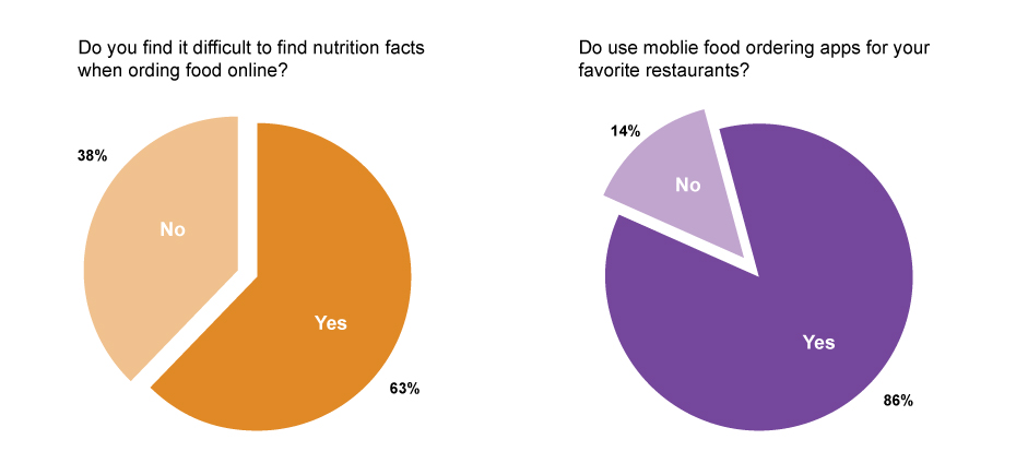
I conducted a survey with a group of people who often order food online through mobile ordering apps from different restaurants and found that users believe that there should be more information transparency when it comes to nutrition facts and ingredients.
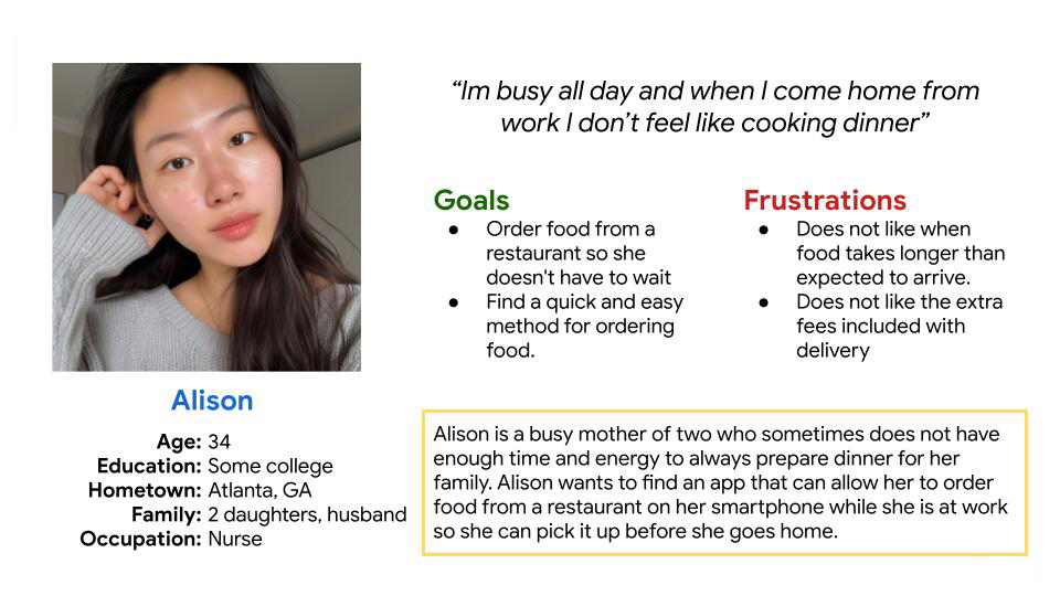
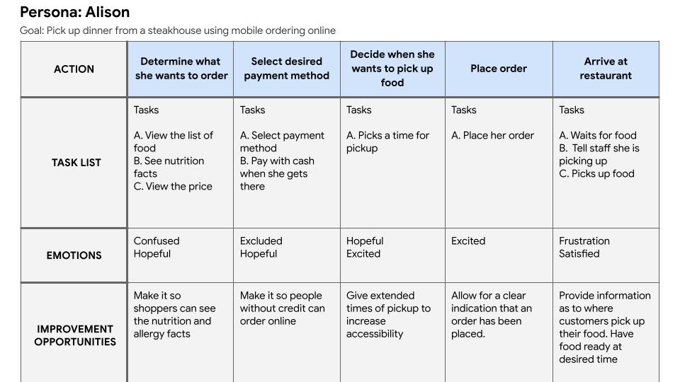
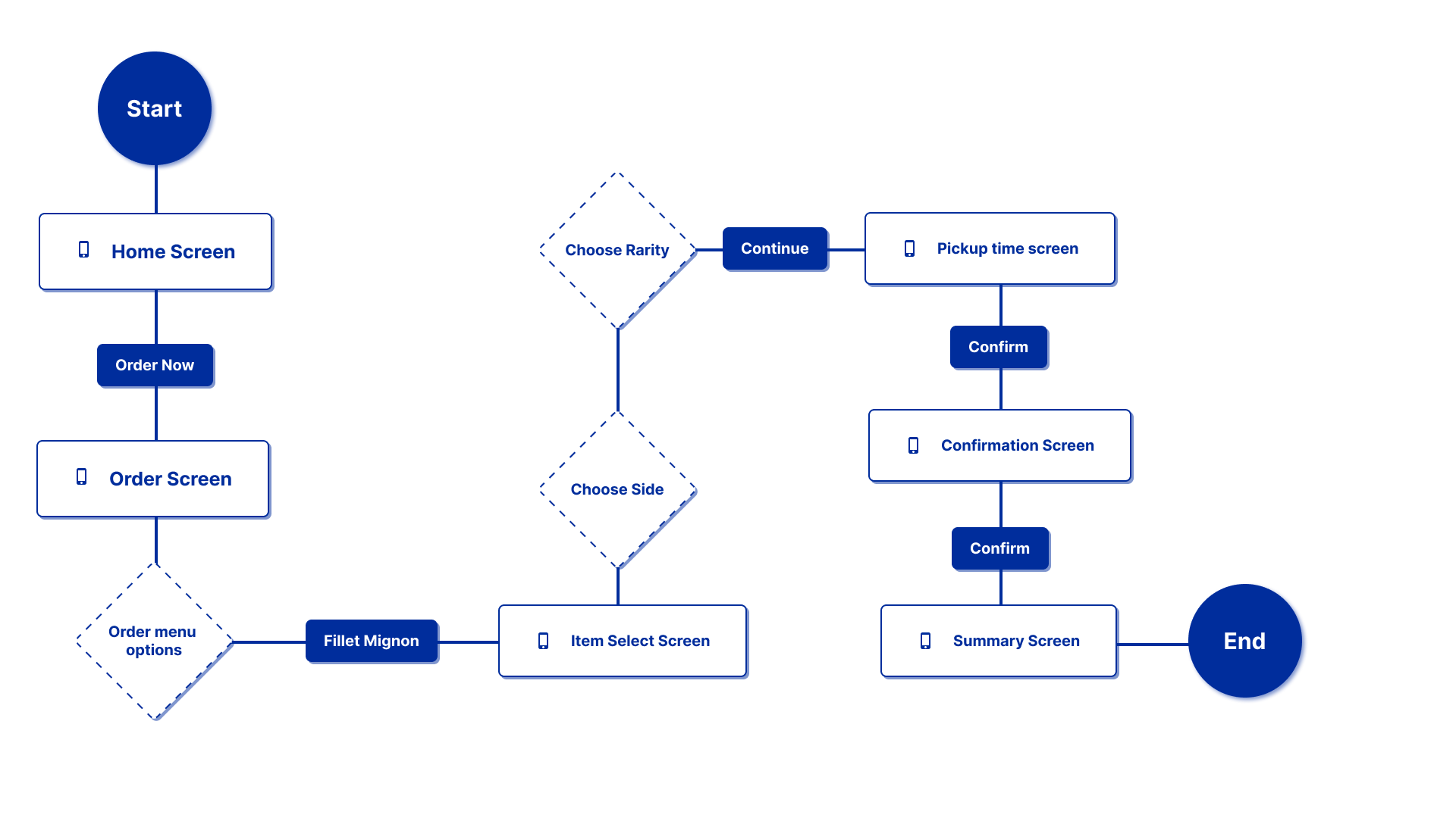
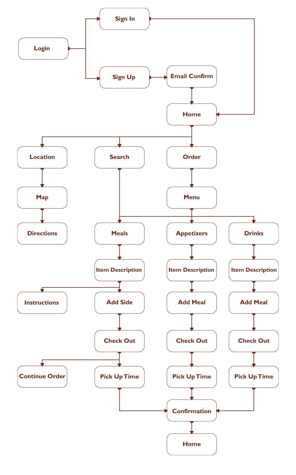
The user flow reflects the required actions to navigate the menu and place an order. The user is trying to order a fillet mignon and a side dish along with customizing the rarity of the meat being cooked.
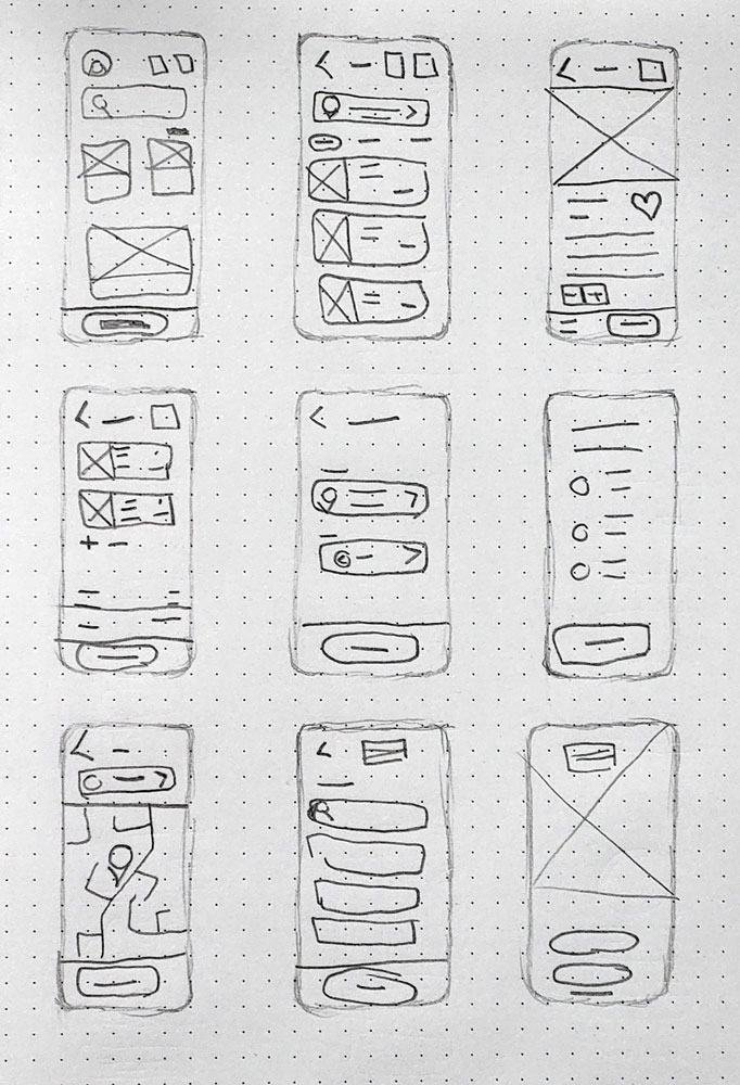
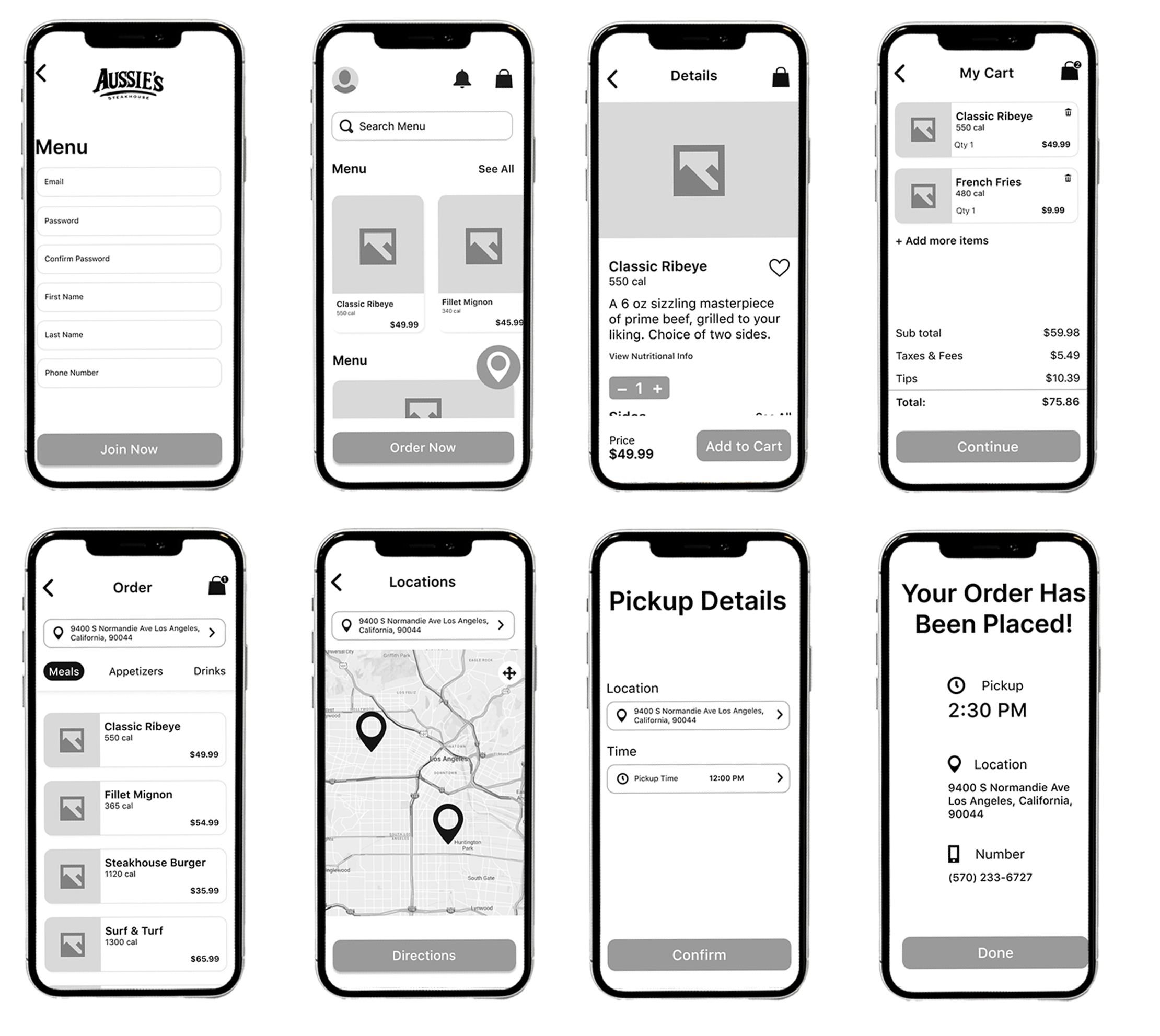
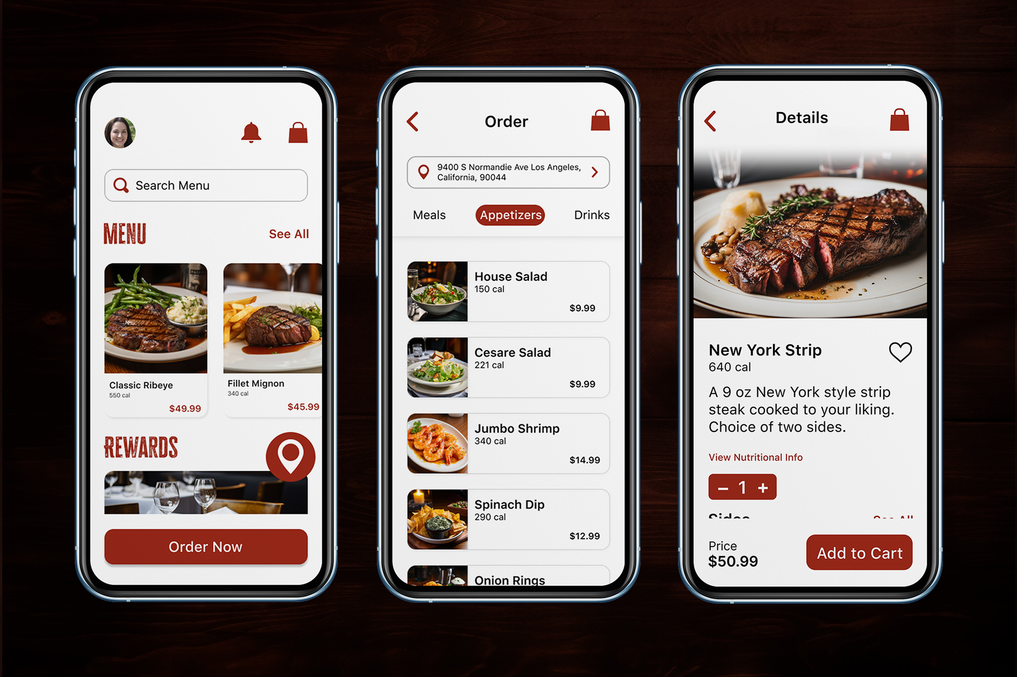
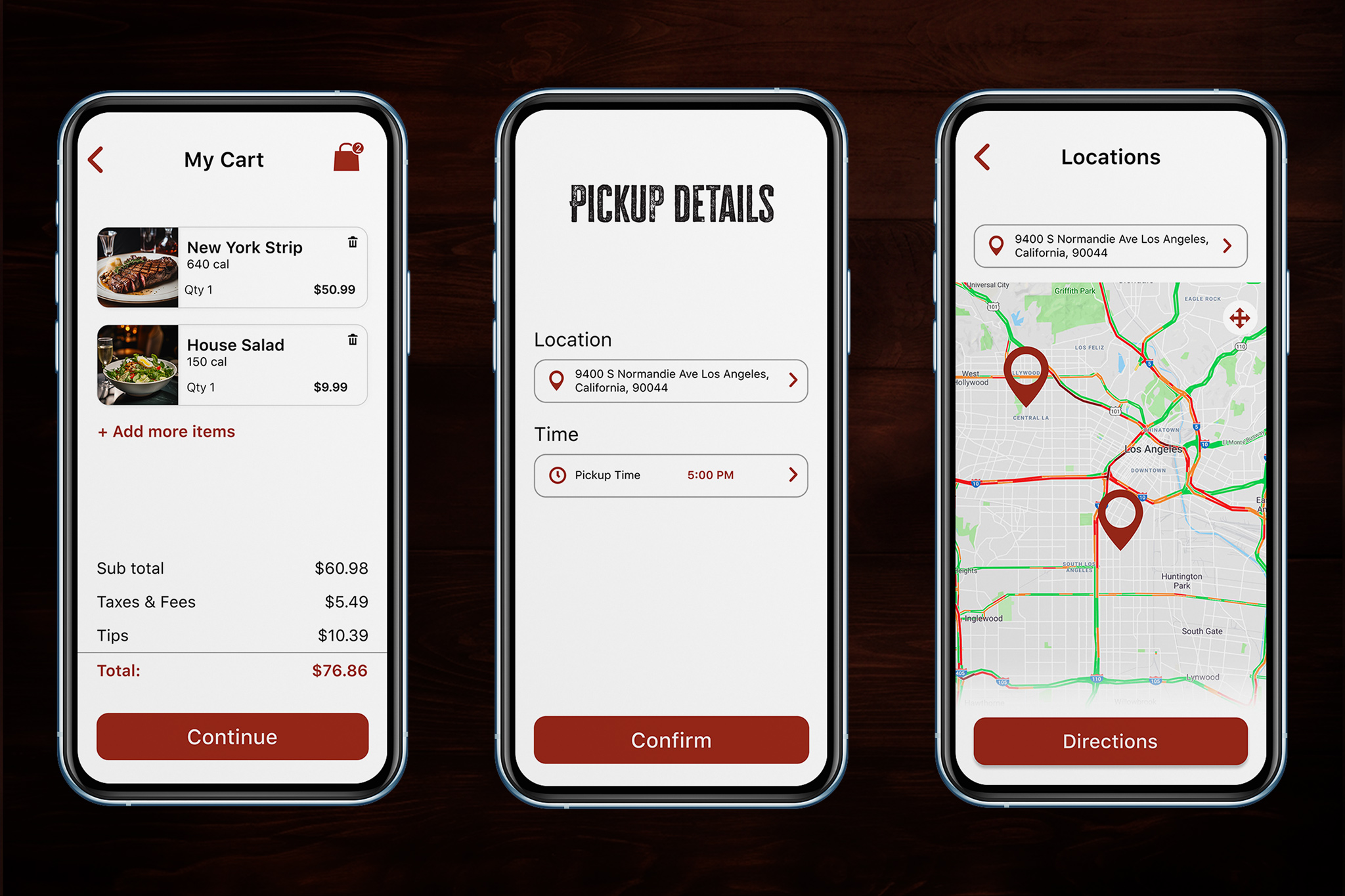
After creating the user persona and user journey I started sketching paper wire frames and then transferring them to figma for digital mockups. During user testing I found that users thought it was unclear where the location button was supposed to go so I placed it as a sticky element on the home screen.
Always keep the users pain points at the center of design
Conducting research and testing help the design process during the ideation stage
Always keep an open mind to changing or scraping a design idea
Feedback is important to the growth and development of any user based design
Data Visualization
Print, Web, 3D
Networking Platform
Wranding
Stationary Design
Branding