
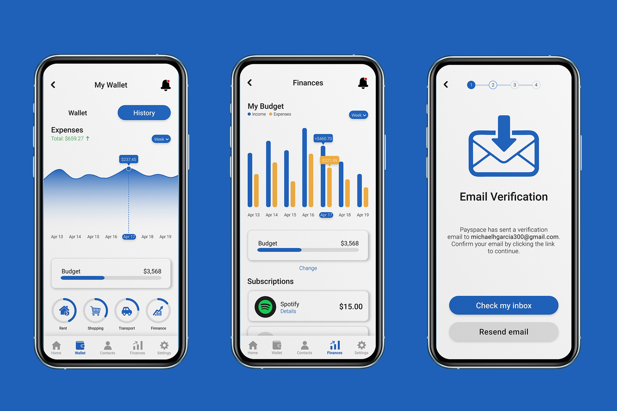
While many mobile wallet apps on the marketplace have extensive features for payment, there are still some missing features from modern-day applications. Personal financial tools are on the rise, with features such as expense tracking, subscription management, and integrated bill payments that allow for a more streamlined way to keep your finances in check.
Payspace aims to bridge the gap between mobile wallets and personal financial tools by integrating key features that are common in most mobile wallets and financial tools. This allows users to save money on subscriptions, create budgets and tack spending while also having the convenience of using one app for all of their spending and financial needs.
Solo UX/UI Designer
January-March 2023
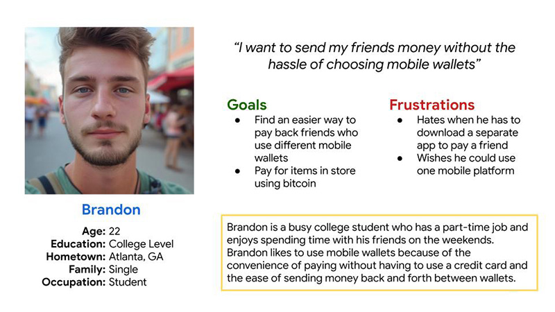
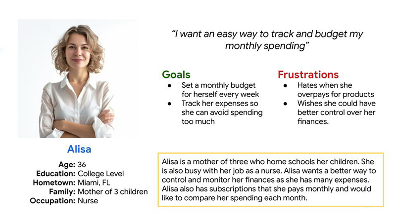
In order to better empathize with my users I first created user personas based on existing pain points within the mobile wallet and financial application field. My user personas reflected users who both wanted to send money to different mobile wallet platforms, and utilize financial tools.
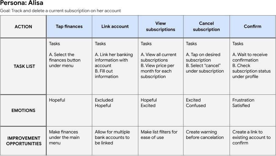
After defining my users, I created a user journey map to break down the task a user was trying to complete and the bumps along the way. Both users had a unique task that needed to be accomplished.
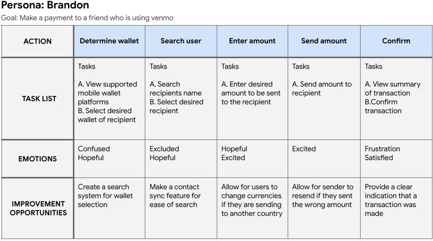
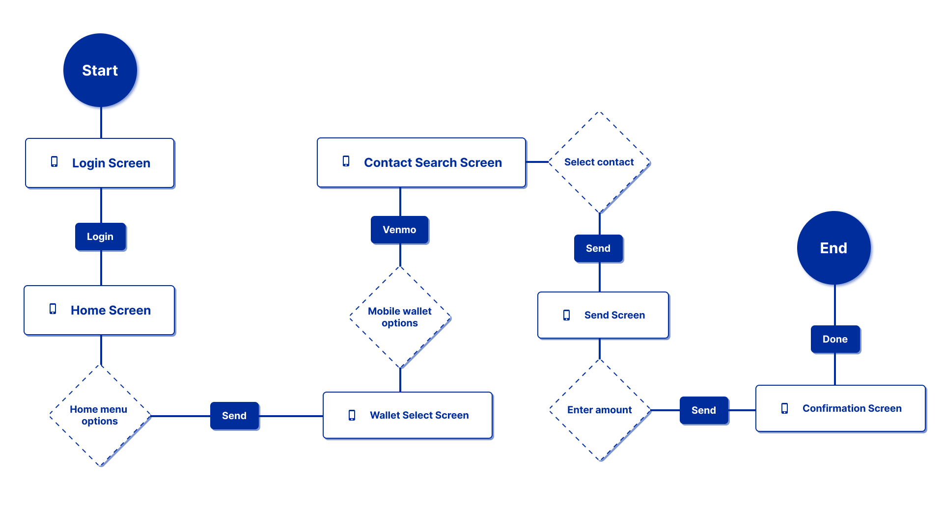
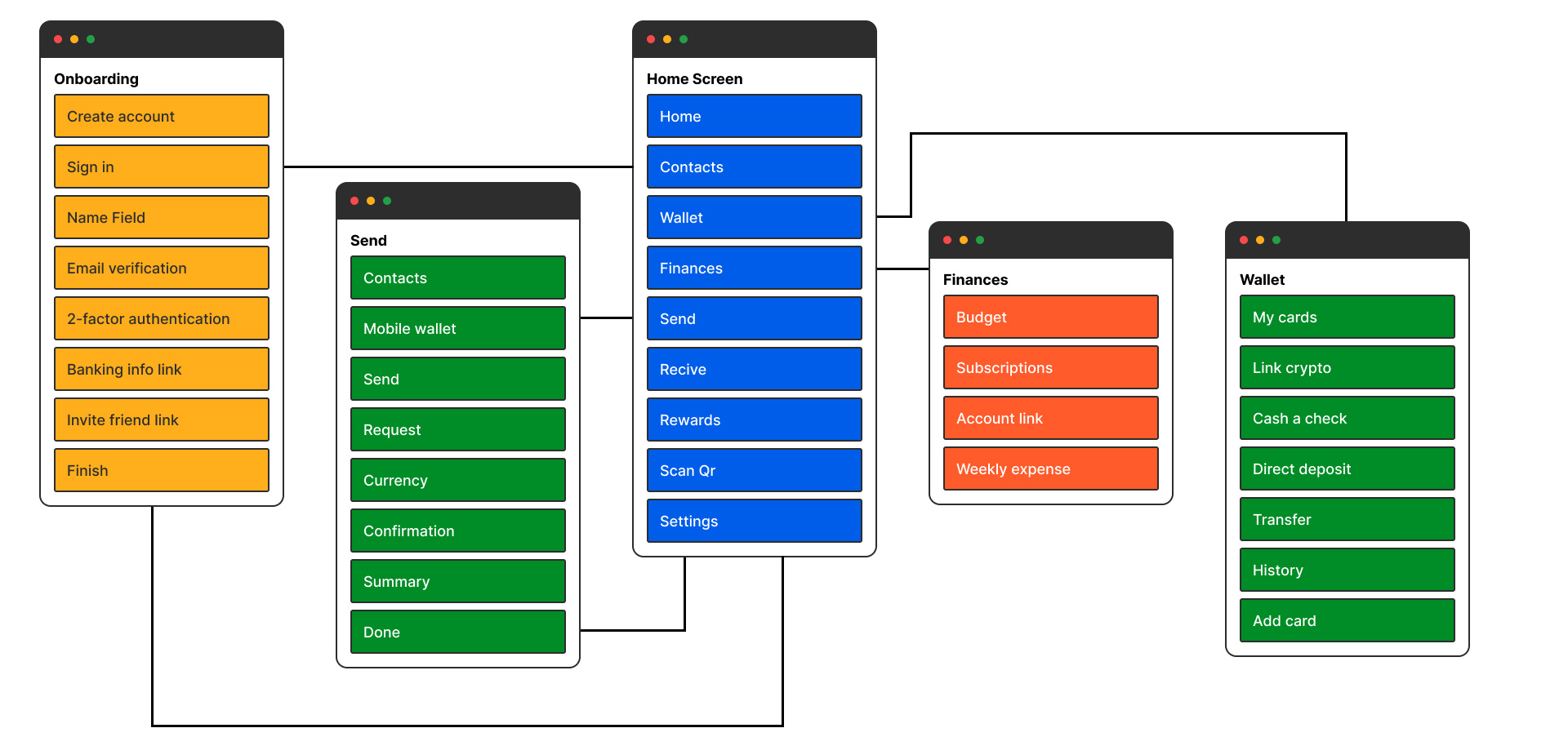
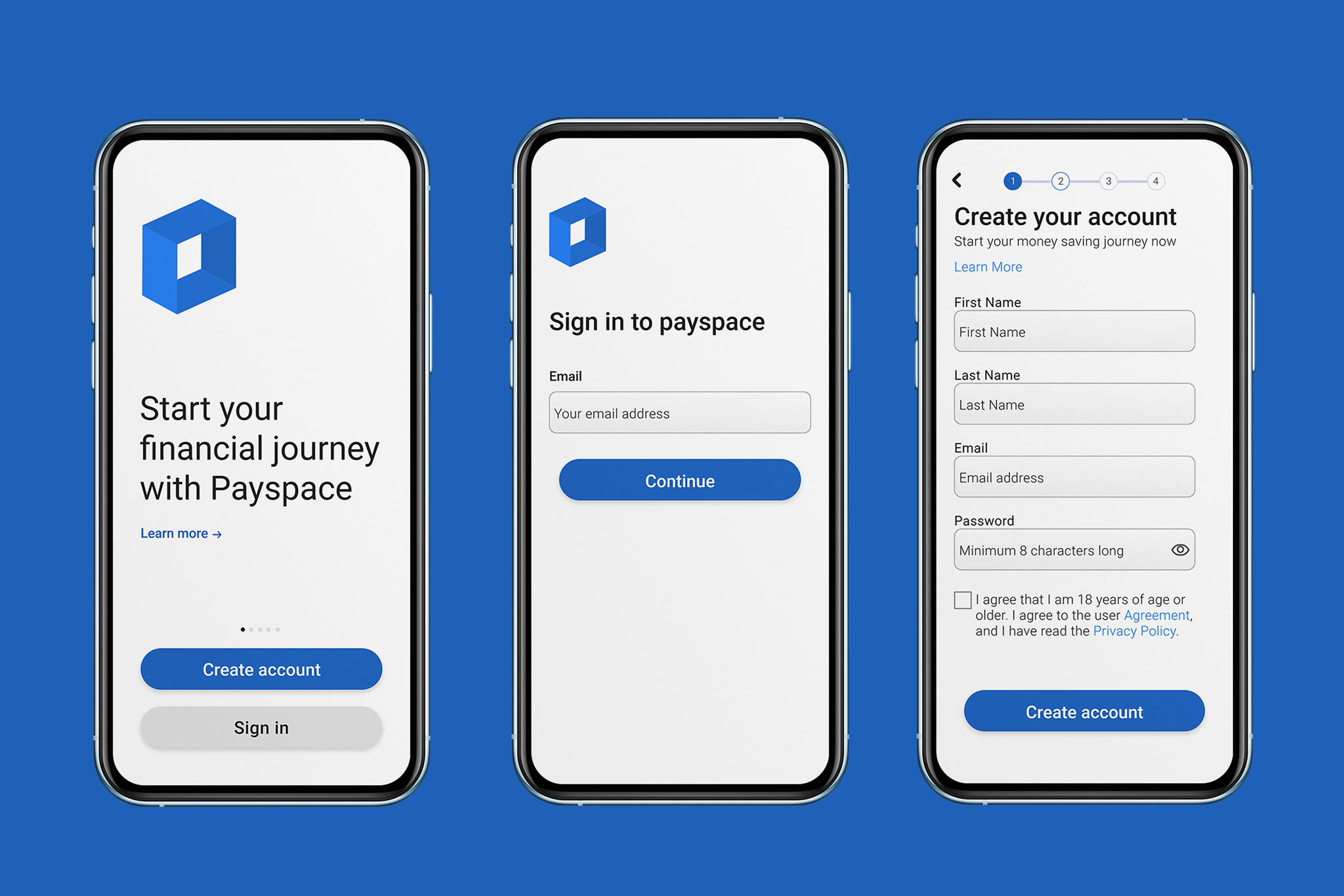
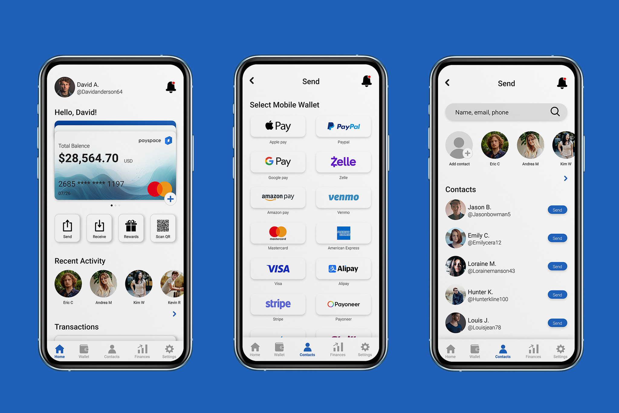
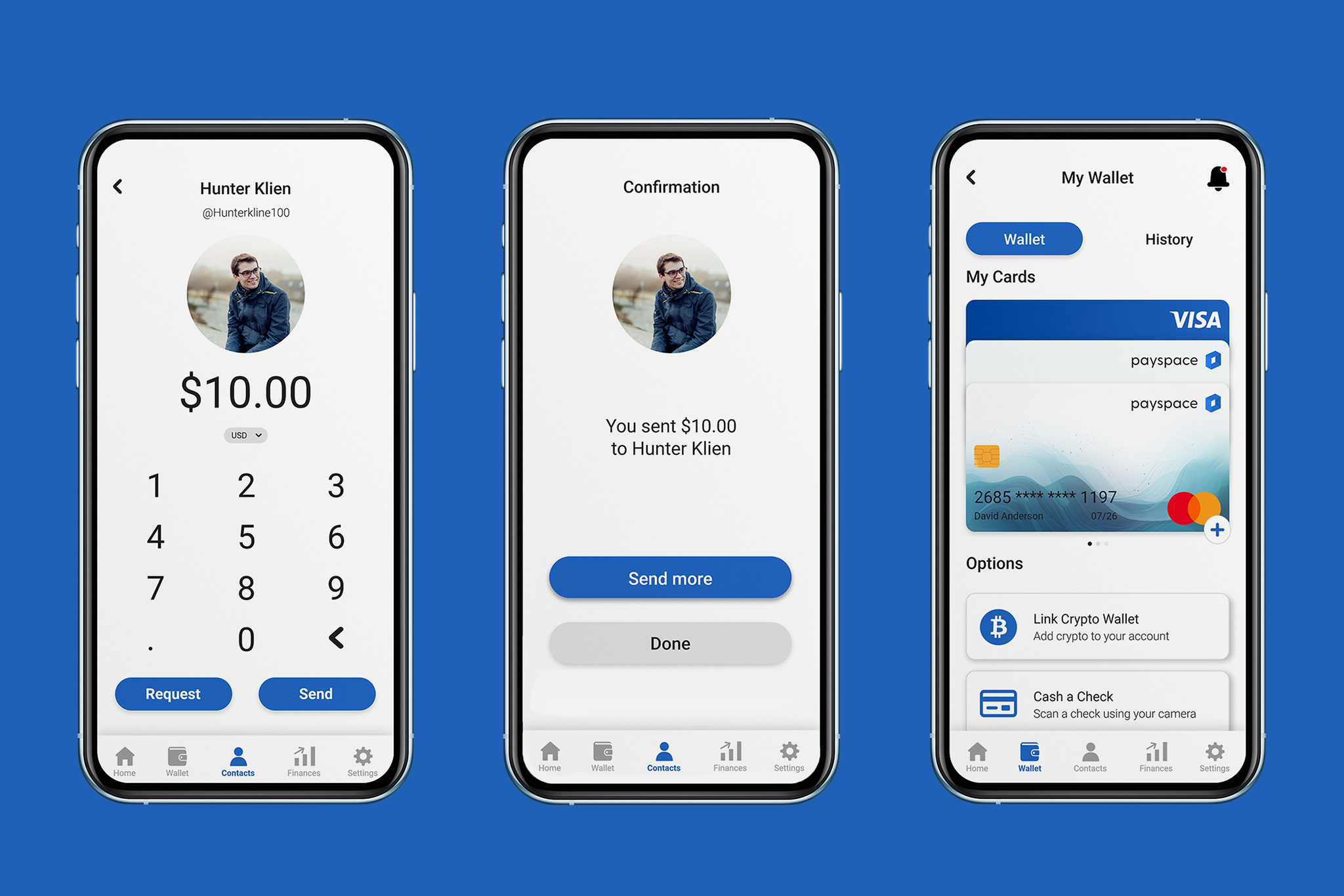
The user flow reflects the steps it takes for the user to achieve their desired goal. In this case, the user is trying to send money to another user of the Venmo mobile wallet app. The original sitemap contains 6 main functions: signup, contacts, send, finances, wallet, budget and subscriptions.
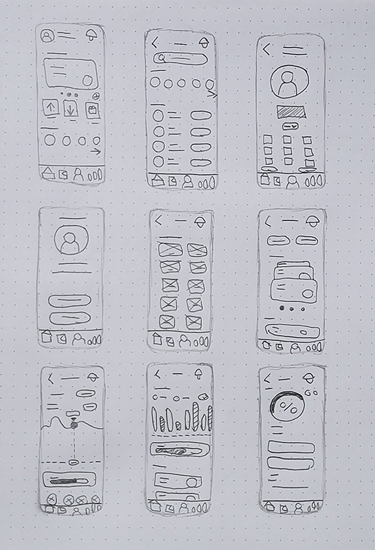
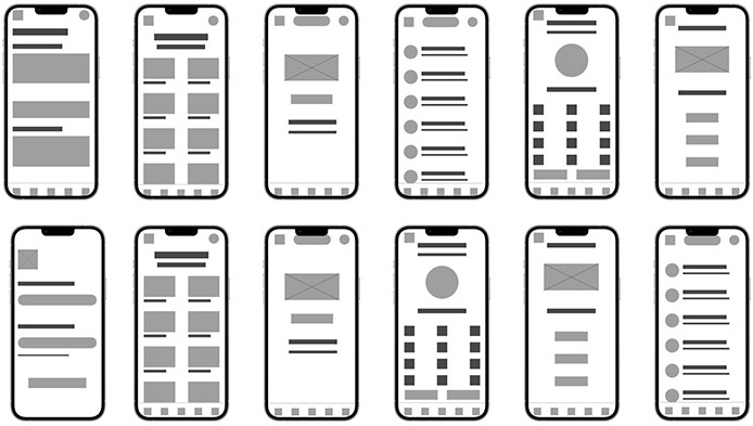
After creating the sitemap and user flow, I started sketching on paper and conducted user testing with 5 participants. After testing I found that users wanted to see a filter feature for their spending to categorize it by day, week, month, or year.
After conducting usability studies on my Lo-fi prototypes I found that users where confused on how the budget tracking feature was supposed to work. I ended up changing the layout on the screen and fixing legibility issues on the text at the bottom of the charts. A also added a filter feature to the budget screen so users could better understand how they are spending money by day, week, month, year.
Always keep the users pain points at the center of design
Conducting research and testing help the design process during the ideation stage
Always keep an open mind to changing or scraping a design idea
Feedback is important to the growth and development of any user based design

Mobile Wallet
UX/UI, Branding
Networking Platform
Web, 3D
Data Visualization
Print, Web, 3D